Digitizing:
Figure 1: Jpeg political map of Iraq provided by University of Texas
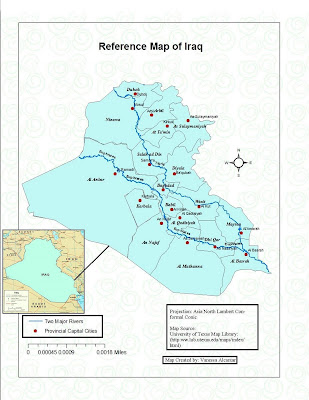
Figure 2: Digital Iraq Map, Used ArcGis to create polygons of the provinces and entire Iraq country shape, shapefiles to create capital cities and polylines to create the two major rivers in Iraq. The jpeg version (picture 1) was used as a reference in order to create accurate rivers , cities, and provinces lines/shapes. This map can now be used to display desired information about this country.
Figure 3: Used the Reference Map to create a thematic map of Iraq. I inserted casualty data as a new column in the attribute table, each number matched a specific province and so now you can see the range of casualties in Iraq.
Data Elevation Models:
 3-D Image of Location
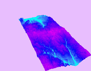
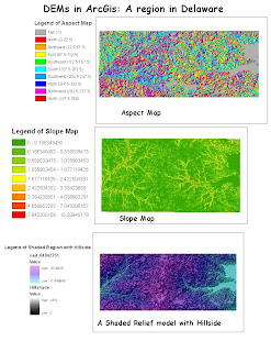
I selected a region in the south of Delaware, near Rehoboth Beach and Seaford. I chose this specific region because of water systems that travel through the land. Using ArcGIS I was able to determine which areas were below sea level and which areas were above sea-level. I also wanted to focus near the water regions in Delaware because I have personally visited, in person, Rehoboth Beach and Other lakes near the south and when doing DEMs it makes sense why the land produces these slopes.
Ned_04842751
Spatial reference= GCS_NORTH_AMERICAN_1983
Datum :
D_North_American_1983
Extent:
-Top=38.7 degrees
-Left=-75.7 degrees
-Right=-75.5 degrees
-Bottom=38.5 degrees
Terrain Modeling:
The main focus in the assignment was to analyze the amount of solar radiation absorbed in the Santa Monica Mountains in all the four seasons (fall, winter, spring, and summer). Isolation will be measured in this lab. In the Nasa educational brief website they define isolation as solar radiation received at the Earth’s surface. The formula used to measure isolation, as described in lecture, is I (Isolation) = S (approx. 1000 W/m^2 on a clear day) * Cos Z (Zenith Angle) . It is important to determine how much solar radiation the earth absorbs . We may determine weather there is enough vegetative land cover in different areas by using the procedure in this lab and this, analyzing the isolation by using the formula, and looking at graphs.The analysis took place by downloading a DEM of the Santa Monica Mountains in the USGS seamless server. I obtained a california vegetation shapefile and changed the projection in order to analyzethe DEM and vegetation successfully. After fixing the projection I went under the spatial analyst toolbar and selected the convert option “features to raster” in order to convert the shapefile into a raster file. After the conversion I clipped both the DEM and vegetation files so that the map can focus on the Santa Monica Mountains. I made a slope and aspect map of the Santa Monica Mountains, I will use this to the look at how far solar radiation will travel in terms of steepness. The next step was to calculate the solar angles for each season. I focused in the solar angles from 2010. I went to this website: http://susdesign.com/sunangle/ I picked the latitude of 34.01 degrees north and longitude of 118.47 degrees west because they are located on the Santa Monica Mountains. After inputing the latitude and longitude. I put the dates in where the seasons would occur and focused the time at 12:00 p.m. (this is when solar radiation is at its peak). I had to repeat this step four times and write down the altitude and azimuth. Under the spatial analyst tool I created a hillshade for each season, in order to produce a map of the season I had to input the solar information I gathered from the solar angle website. I placed the california vegetation shapfile as a transparent shadow in each hillshade data frame so that I can analyze how solar radiation varies. I created a table in where all the vegetation type (species) is listed and its frequency on the Santa Monica Mountains. I calculated the isolation for each season manually by using the formula I=SCosZ. I set the S= 100, and calculated the Z using the zenith formula in the Nasa educational brief website. Lastly, I collected all six maps and organized them by order so that you can easily find and analyze each one individually. The vegetation shapefile is underneath the DEM so I may analyze the land cover in the different seasons. In the four seasons the summer hillshade produced the brightest map. There are some dark portions, these portions are usually steep mountainous areas where not enough solar radiation is absorbed. It is evident that the earth tilting towards the sun . therefore there is a higher amount of solar radiation absorbed. The solar radiation absorbed during the summer was 957 w/m^2 ( highest out of all the seasons). In the spring and fall both maps looked the same and there were darker spot in mountainous areas and it was evident that the mountain regions were not absorbing enough solar radiation as they were in the summer. The isolation absorbed in the fall and spring was 801 w/m^2. They both had the same number for because the solar declination in the spring is 0 degree, there is an equinox. The earth still absorbs a generous amount of solar radiation and differs from summer by 156 w/m^2. Lastly the season with the less absorption of solar radiation was was winter. During this season the earth is tilted away from the sun which result in less hours of sunlight . This explains why the winter hillshade map is the darkest . The total isolation for winter is 511 w/m^2 , that is approximately 43 % less than the amount in the summer. Vegetation would have a had time surviving during this season sue to the lack of isolation. The statistical graph I created was the mean of all the vegetation in the Santa Monica Mountain region. The symbols translate into the following : “UA” stands for “Urban-Agriculture,” “HG” means “Annual Grass,” CA means “Chamise-Redshank Chaparrell,” and lastly “SS” means “California Sage Brush.” These were the four types of vegetation of the Santa Monica region. The Chamise-Redshank chaparrell was the most dominant in the region, depicted by a soft pink in all the maps. Urban-Agriculture was low and therefore suggests that there is a low number of human disturbance in the mountain area, light blue on all the maps.
Now that I have the formula for isolation and the maps for the different seasons I can go into further detail with this lab. I can analyze different years of the Santa Monica mountain region and determine if land cover or vegetation has changed over the years due to solar radiation. I can also determine weather Isolation varies in different year and I can calculate an average if there is a variation.
NASA Educational Briefs webpage , http://edmall.gsfc.nasa.gov/ inv99Project.Site/Pages/
science-briefs/ed-stickler/ed-irradiance.html
Week 2 Lecture, Lecture2_DEM_Algorithms.pdf
Suitability Analysis:
Proposing Downtown Los Angeles as an extension to the UCLA. UCLA is an approximately 400 acre campus that employs and houses a total at least 60,000 people (UCLA website). It was first founded in 1919 and has been around ever since in the west side of Los Angeles. At one point this campus can only hold so much people and therefore we should all start thinking of where else UCLA may branch off another campus. I am proposing that the new satellite campus should be built in downtown Los Angeles. I did some suitability analysis by analyzing population, transportation buffers, and the land uses Los Angeles county offers. The suitability analysis will determine that downtown Los Angeles is best suited for the new campus that will hold an additional 5,000 staff members and students. I have made a layout of six maps presenting the current location of UCLA and the other three map represent the future expansion of UCLA, which will be referred to as UCLA2. The first map depicts land use suitability. Near UCLA there is currently a high vegetation density (depicted by green), low residential areas near the mountains (depicted by yellow), and a few commercial and office buildings (depicted by a dark green). In Downtown Los Angeles, near Broadway and 4th they mostly consist of skyscrapers (light brown), offices (brown), shopping areas (Magenta), and vacant spaces (dark purple).
The second map shows the population in downtown Los Angeles and west Los Angeles where UCLA is located. By analyzing the map UCLA averages in the dark blue area, 5971-13429 thousand people. Downtown Los Angeles on the other hand falls in the purple area that averages 3152- 5970 thousand people. The transportation map locates the distance freeways and airports are from UCLA and downtown Los Angeles. UCLA is closest to the Los Angeles International Airport and the Santa Monica Airport. It is also surrounded by two major highways which are the 405 North/South and the 10East/West.Downtown Los Angeles is a bit further from the Los Angeles International airport but there are more highway options. Downtown has about 5 highways that intersect one another at some point. These highways are the 10East/West, 101 North/South, 110 North/South, 2 North/South, and the 5 North/South. The more highway access and closer proximity to highways the easier it is to travel from one place to another.
Downtown Los Angeles makes a great location for the new UCLA campus because of the current office space location and vacant areas that are available for redevelopment and construction.The offices, businesses, architecture and current culture that remain in downtown may benefit student in different fields such as business majors or cultural-related majors, just to name a few, in their research.
Downtown was an iconic location in the “hey days,” 1950s (Pomfret). Everybody wanted to be in downtown but it went downhill. Just recently people are starting to invest millions in order reconstruct and develop a greater downtown (Pomfret). A prestigious university like UCLA deserves to secure a place
in the spotlight in Downtown Los Angeles along with the Staple Center and L.A Live (entertainment shopping and eating area). People are slowly moving into downtown which makes it less crowded than the west Los Angeles where UCLA is currently located.
Transportation is very important in Downtown. UCLA may be closer to the L.A.X. but downtown has more highway options. This will give new employees and students different options to choose from. Major bus routes all intersect in downtown Los Angeles which makes it easier to travel. The 10 West is easily accessible to travel back and forth between the UCLA main campus and the satellite campus.
References:
Pomfret,John. “Downtown Los Angeles Gets a $10 Billion Remake.” The Washington Post
UCLA Website. “http://www.ucla.edu/about.html.”
Georeference:
Georeferencing images is a common task that is used in remote sensing, uses
image registering (Week 5 Lecture). The main point of georeferencing is to apply real-
world coordinates onto maps and images (Week 5 lecture). Also according to the
lecture the points used on these maps are called control points and they help develop
models out of images in order to do G.I.S analysis. In this lab I was able to apply these
concepts. The task of this lab was to to gather in groups and collect GPS points
throughout the UCLA campus. There were an estimated 30 control points or so all
together. I selected 15 of the points suitable for the ortho image and that also gave me a
small error number.
If you zoom into the map you will see the 15 cross hare symbols that I used as
my georeferencing control points. Here is a detailed table that shows the points I kept:
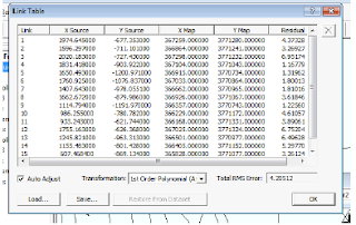
My points are equally dispersed throughout campus. The total RMS error from the
control points was 4.20512. If the error is more than 10 your model will not be precise. I
chose points that were located away from trees or that were easily covered or interfered
with the GPS signal. When I added the street layer onto the ortho image some of the
streets did not align perfectly but their location was too far off from the original position
of the street. For example Westwood perfectly aligned with the ortho image. A street
that was off was Strathmore, maybe I should have included a control point near that
area so that the street position would line up better.
There are some things you need to look out for if you are thinking of using GPS
and GIS together for analysis. The main issue is the location points your GPS gives.
Signal is crucial in order for a GPS unit to give you precise data points. So if you are in
a region that is covered by buildings or vegetation such as tree there will great error and
your GIS data will be inaccurate. In G.I.S it is important for all the data to have the same
projection. Once you receive GPS points always take time to include the projection
coordinate system into your GPS chart. All projection should match so that the analysis
you produce using GIS is not uncertain. Also, GPS data should be dispersed evenly
throughout the map so that models produced using GIS are accurate.
References:
Professor Sheng. Lecture 5.“Lecture5_ImageRegistration.pdf”
Watershed Analysis:
In lecture it was explained that watershed analysis refers to the process of using DEM’S and raster data operations to alienate watersheds and focus on stream networks
(Week 6 Lecture). Watershed analysis are important for those who are researching in
the fields of hydrology, water resources, and environmental applications. In this lab I
applied the watershed analysis process on the Tibetan Plateau. Based on the Tibetan
DEM I was able to analyze the stream orientation and break the streams into 6 different
orders. While conducting my stream analysis it was assumed that water in the streams
flow from high to low and it is also continuosly flowing.
The study area, Tibetan Plateau, extends about 7 degrees latitude and 10
degrees in longitude. You can take a look at the Landsat image map in order to give
yourself a topographic idea of the area I will be working on. The quality of this image is
not the best. Judging by the resolution it appears that it is about less than a 90 meter.
This is poor compared to other satellite images that can be accessed at 10 meter
resolution. Judging by the image this area is is not affected by urbanization and
therefore it is undisturbed by humans for now. All the data obtained for this lab
consists of a ETM Image Mosaic of the plateau. The DEM of this area was also used
and lastly the shapefile (polygons) of the lakes. This information was obtained from the
class drive. The last piece of information used was obtained from the hydroshed
website. It was the drainage network of the the Tibetan Plateau.
The following steps were used to conduct the analysis of the drainage. I used
the lab and lecture to guide me through the analysis of the area. The first step was to
upoad the DEM model of the plateau onto arcgis. The DEM need to get some work
done before using it for the watershed analysis. In lecture it is recommended that the
DEM is filled, any depressions that are in the DEM will be filled in so there are minimal
errors in conducting the analysis. The basin and the area need to have a Z value in
order have a precise analysis, since there were non fillings in the DEM (which make in
imprecise). The Z value used for my analysis was 15. After doing the DEM preperation
a new DEM was created with the Z value and the filling. The second step that I took
was to create a flow raster, which shows the direction the water will flow out of each
cell (Week 6 Lecture ). In order to determine the flow I used the flow direction
determination from the lecture slide, where the elevation drop is showed from the
center cell to the right cell, +8. In the third step I calculated the extent of the drainage
system using the Basin tool. I reclassified and then converted the raster to a feature.
The basin is now turned into a polygon ( defined by a black lines) . Next, I converted
the flow accummalation raster into a feature . This is the step where I give the streams
directions.This raster was the outcome of the flow direction raster. A value (100) was
produced that resulted from the lowest class stream, a stream that receives a
significant amount of water from areas in where water is travelling from peak till
downward. In this step I used the Strahler method to produce the order of the streams
using the order of magnitude. My input data in order to determine the order was the
stream reclassification and the flow direction raster. Polylines were created that ranged
from 1-6 and they are depicted in different shades of blue. Lastly I arranged all my
layers so that you can see the orders of the stream, the direction, basin polygon, and
lake shapefiles. Overall I played with my values until I felt the map was precise. I also
rearranged the files. I left the streams on top of the lakes in order to see where they all
travel and the classes they fall under. I used it as a visual, to help analyze the basin.
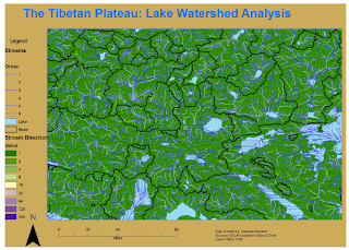
This analysis helped analyze the lakes and the streams in the basin. In Map one
can see the flow of the streams and where the the streams connect to the different
lakes. Once you see where the streams connect you can see which basin the lakes are
located in. Some streams may shares basins with one another. Also, with the results
with this analysis you can also determine the type of land that is located in the area.
For example the area may be a wetland. This analysis can also be used to to determine
if the land is suitable for future land use. As you can see the area is not populated,
therefore it maybe to interest for some urban planners to use the land building or
anything business-related. There are alot of streams so the soils maybe easily erodable,
sandy like due to the rocks and gravel that constantly travel. That is not something that
is suitable for building structures on. This is only an example of how this analysis may
be useful.
When conducting this analysis you should watch out how you calculate and
recreate your raster files. Make sure you input the correct files if not you will not get
the desired results. For example when creating the stream direction it is important to
get a precise value.
References:
Week 6 Lecture. Watershed_Analysis.
Network Analysis:
In the lecture network analysis was described as a procedure that used to model the real world network system of linear features that has the appropriate attributes for
the flow of object (Lecture 7). The network, as mentioned in lecture as well, is based on
lines in where intersections meet. The lines are continuous and so not have gaps or
breaks. This is the arcGis version of google maps. The only difference would be that
location points are enter manually.
In this lab I wanted to located public golf courses near West Los Angeles. Many
places near the westside have private country clubs that are not open to the public,
which makes it difficult to enjoy my golf hobby. I wanted to make a map where someone
will be able to find the nearest golf course that are accessible to the public . I started the
location near my apartment, 3400 Greenfield Ave, Los Angeles, ca 90034 and would
then which two public golf courses are best suited for me to go to. The nearest one to
my apartment was Rancho Park Golf course, 10460 west pico blvd., Los Angeles, Ca
90064. it is located 2.6 miles away from my apartment. It will take about 5 minutes to
get here (depicted in green in the “Time Difference” map. The second public golf course
is Griffith Park Golf Course, 4730 Crystal Spring drive, Los Angeles,Ca 90027 is locate
about 18 miles away from my apartment. It will take me more than 15 minutes to get
here (depicted in red). Overall I was able to see which public golf courses are near my
apartment and the distances. I compared my results with google and they were
accurate.
In order for me to accomplish this lab I had to to upload the street shapfile onto
arcgis along with my recreation shapefile from the UCLA mapshare website. I activated
the network analysis tool in both analyst and extentions. From there I created two
different routes for each golf course. As I found the golf course I looked for my barriers
using the binocular icon and confirmed my locations., as mentioned above. As soon as I
finished my routes I started to create a new service data frame. The new service data
frame shows three time intervals (5-15 minutes) between the parks themselves. I
located the facilities and soon after I created the three polygons. I also specified in my
values the three time classes I wanted to display. At the end of the lab as you can see I
created three maps showing the time difference, and each individual route from my
apartment. Similar analysis can be used to analyze locations between different places.
References:
Lecture7_Network_analysis.pdf, Professor Sheng


